-
Architects: Barkow Leibinger
- Area: 8335 m²
- Year: 2015
-
Photographs:Stefan Müller, Ina Reinecke/ Barkow Leibinger

Text description provided by the architects. Aufbau Haus 84, Berlin.
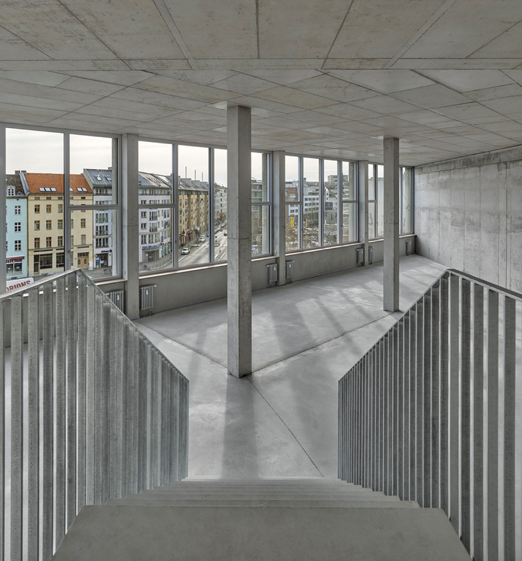
An open, flexible, reinforced concrete skeleton and simple, robust materials – with this typical loft-character, the second construction phase of the Aufbau Haus offers a fitting framework for creative industry tenants with their varying usage requirements and individual configuration needs.

Concept | Typology.
The Aufbau Haus 84 closes a gap in the city block at the southwest side of Moritzplatz in Berlin Kreuzberg. The project arose out of a 2012 competition and complements the neighboring building that established a creative center combining cultural offerings like exhibitions, theater and club events with numerous retail entities and service suppliers in support of the creative sector. Aufbau Haus 84 & 85 is named after the Aufbau Verlag, whose headquarters are on site.

The new building mediates between the historical Elsnerhaus, dating back to 1914, and the first building section, Aufbau Haus 85: the former is characterized by the strong relief of its façade executed in shell limestone; the latter by its exposed concrete façade and large-scale openings (architects: Clarke und Kuhn, 2011).

In its own architectural language, Aufbau Haus 84 connects the old and the new within the tradition of converting unused industrial and commercial buildings into loft spaces; the nearby Pelikan-Haus on Ritterstrasse by Kurt Berndt, or the buildings at Oranienplatz and Engelbecken designed by Max and Bruno Taut are emblematic examples found in the complex’s immediate Kreuzberg surroundings. Further important design references were the timelessly modern industrial buildings by Albert Kahn, including his Detroit building for the Packard Motor Car Company.

Urban planning | Interior organization.
Regarding urban planning, the five- to seven-story building closes the chamfered border of the square and the perspective alongside Oranienstrasse. The new building represents the historical, sub-divided plot layout of the pre-existing city structure: It is divided into three segments, each with different floor heights.

The most prominent, corner building section angled towards Moritzplatz boasts generous ceiling heights and a spacious entrance area; an intermediate building abuts split-level to this corner structure, situated alongside Oranienstrasse and with reduced, functional floor heights; a narrow passage building to Elsnerhaus approaches the visual language of the extant building’s façade structure.

Receding back from both sides of the building, a penthouse rises above the building sections on Oranienstrasse, meeting the height of Elsnerhaus. Several cuts into the volume — the funnel-shaped central entrance; an open, large-scale, second floor loggia overlooking Moritzplatz; and an arcade passage to Elsnerhaus — create direct pathways and sightlines to the inner courtyard, connecting it to the city space.

Gastronomy, an exhibition space and a gallery occupy the ground floor. The remainder of the building consists of modular, flexibly linkable units rented to different artistic and creative industry entities like the „design akademie berlin“, film companies, agencies, architecture offices, and design and music studios.

Construction | Façade | Material.
The appearance of the new building is characterized by its gridded concrete structure, visually reinforced on the façade via lightly colored, mounted precast concrete elements. In leaping between different floor heights, a variegated grid pattern is created.

On the upper floors, the resulting fields are filled with solid dark-grey granite panels. Height variances among the natural stone slabs, as well as the directional shifts within their diagonal grain, emphasize the intersections of the construction, while the variably proportioned recesses within the concrete grid mediate the transitions between the neighboring buildings.

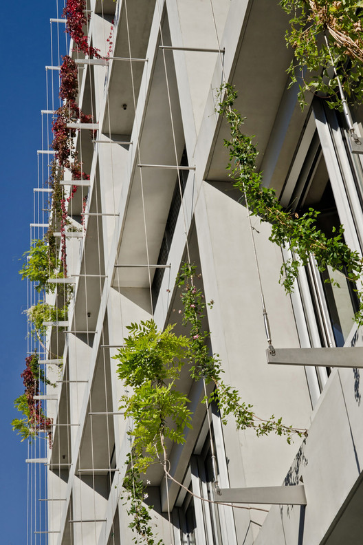
The façade on the courtyard side is based on the same design principle, but maintains a different appearance via loggias and greenery through integrated planting troughs: over the course of time, the strict concrete structure will be overgrown by climbing plants. The offset penthouse differs from the concrete construction: wooden cassettes span an open, column-free interior flanked by terraces, providing sweeping views over the city’s rooftops.


