.jpg?1433130355)
These days, the production of architectural renderings is something of a digital arms race, as the more sophisticated visualization becomes, the more of a disservice you do to your designs if you're not able to present clients with increasingly photo-realistic imagery. In this post, originally published by ArchSmarter as the first in their "Pro Smarts" series which features tips and tricks from seasoned professionals, Jonn Kutyla from PiXate Creative describes his seven-step process for creating more realistic renders.
Creating photo-realistic architectural renderings requires careful planning and attention to detail. Adding minor details to your renderings can be time consuming, but it is certainly worthwhile. Some of the smallest details have the greatest impact on the realism of the rendering. Today we’re going to focus on the site around your building. This isn’t going to be a tutorial for specific software, but rather a guide to using nature to make your renderings more believable.

Revit and Sketchup are great design tools but neither has the ability to create true photo-realistic renderings. You’ll need to use Photoshop to achieve the effects I outline below. If you want to do this in your rendering software, you’ll need to use an application like 3ds Max, Modo, Houdini, or Blender.
So let’s begin. Here is our starting image:
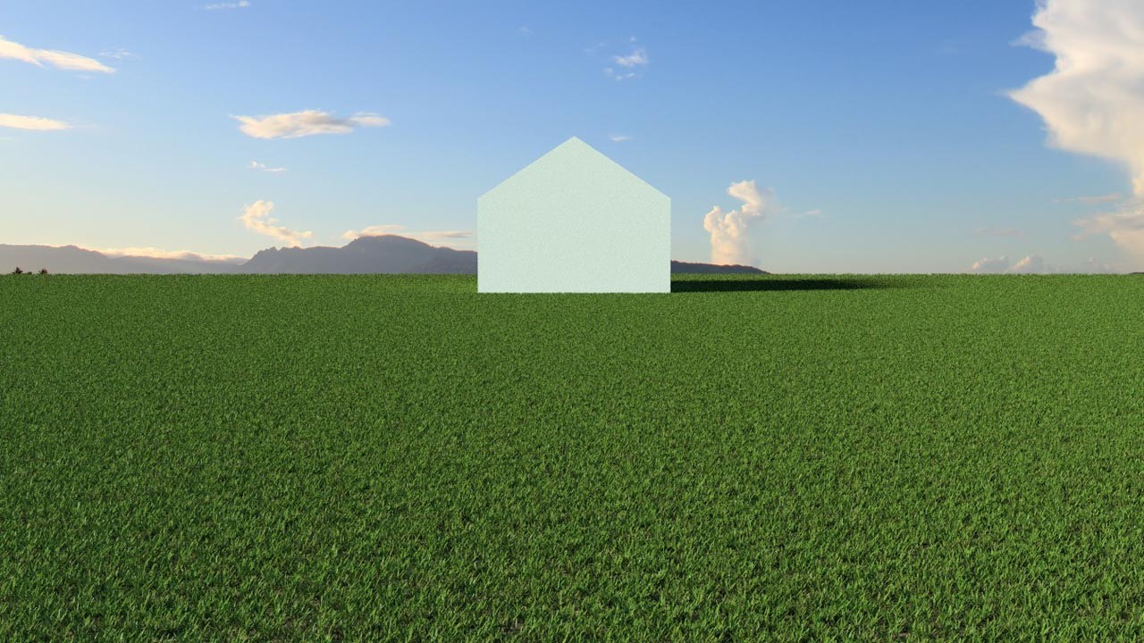
Step 1
We’re going to add some grass and ground variation. Change the height of the grass and don’t make the ground perfectly flat like an ice skating rink. In the real world grass grows at different speeds. Also, seemingly flat ground isn’t really flat. The natural world is filled with imperfections and one of the biggest tells that an image is computer generated is the lack of these imperfections.
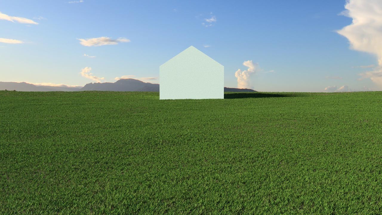
Step 2
Add some streaks in the grass to show that a lawn mower has passed over the grass in different directions. When grass is cut, the lawn mower will put the grass blades at different angles. We can reproduce this effect to increase the realism of the image.
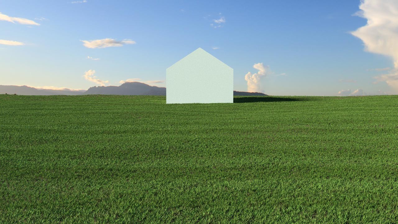
Step 3
Add some shadows. They can be shadows from another building, a tree or something else altogether. This is the critical part of the render. We need to show there are things in the scene other than the building. The lack of shadows is a huge giveaway that the image is computer-generated.
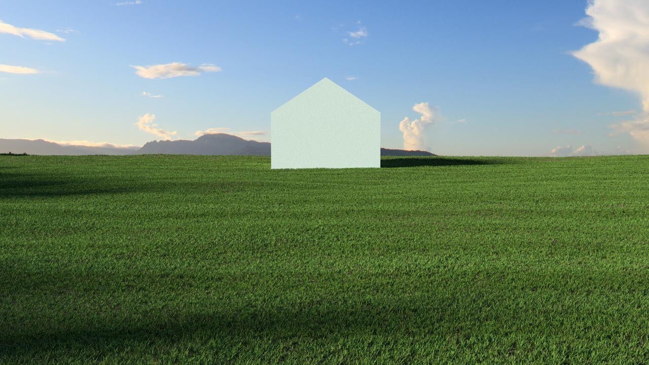
Step 4
Adjust the shadows and add different levels of grass thickness. Some areas should have a lot of grass while a few areas should be thinner. Don’t be afraid to let some dirt show. Again, more variation is key.
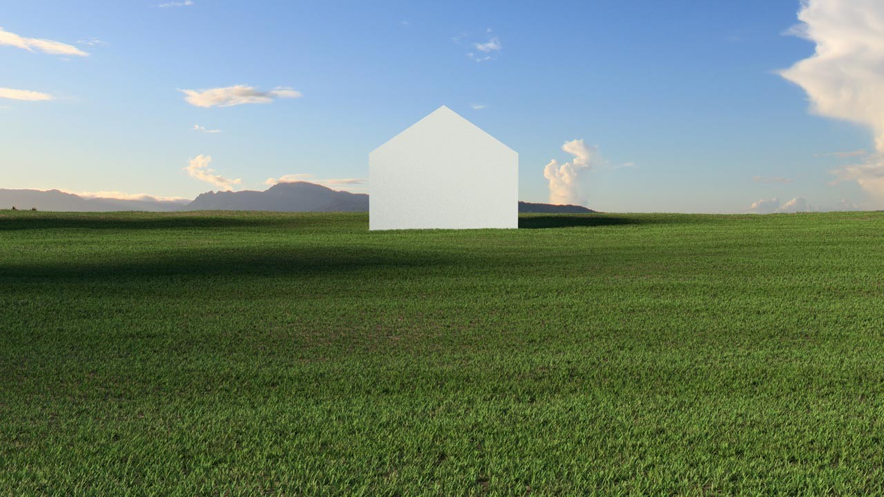
Step 5
Add different types of grass. Unless you’re specifying AstroTurf, there’s no way you can have just one type of grass. Even the nicest lawns have different species of grass. Again, the key to a believable image is variation!

Step 6
Add some dandelions and random leaf clutter to the site. Sure this sounds tedious but we’re trying to make this as life-like as possible. Real life isn’t all perfectly manicured all the time.
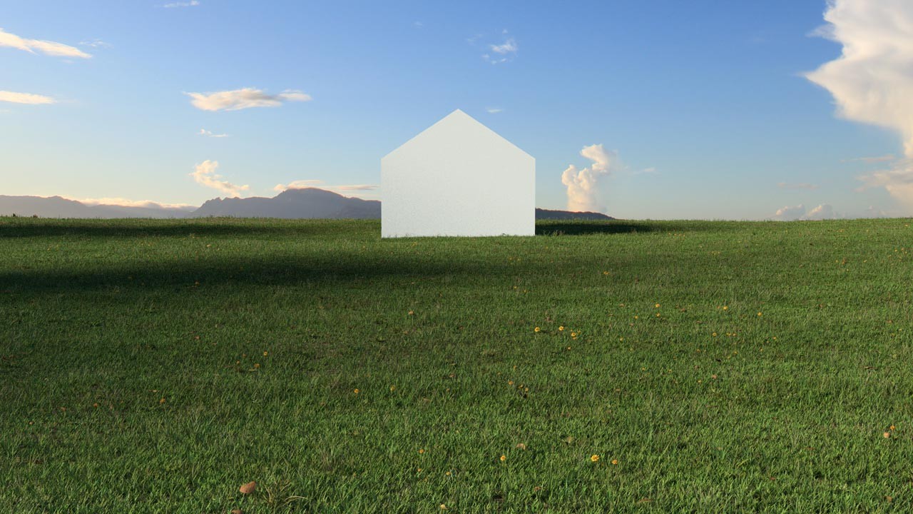
Step 7
For the final step, add some color variation to the grass. In this case, I added a slightly brownish green to some areas of the grass. It’s subtle but adds an undeniable level realism to the image.
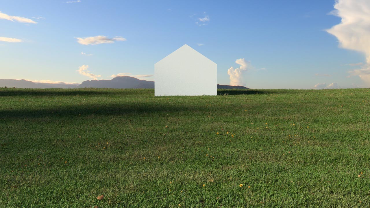
Conclusion
Here is the before and after comparison:
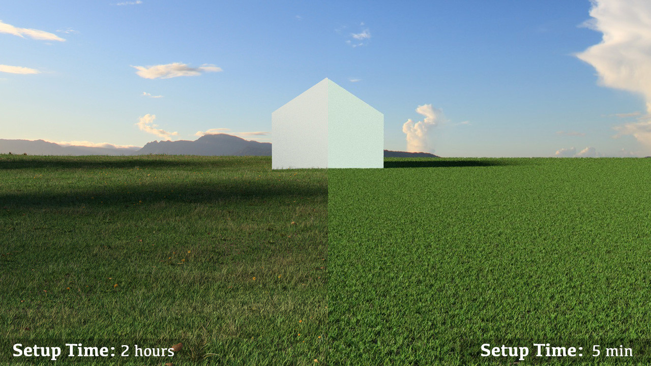
Yes, it takes more time to create photo-realistic images but the result is a much more compelling image. Doesn’t your design deserve it?
Whenever you hear that your renderings aren’t interesting or believable, it’s most likely that some of the small details are missing. It takes time to get the details right but like all things worth doing, practice makes perfect.
If you are looking for advice on how to improve your renderings, please contact us. We’d be glad to help!
Jonn Kutyla is the founder of PiXate Creative , a company that specializes in creating compelling 3D visualizations. If you are interested in more information, please visit us at www.pixatecreative.com or connect on LinkedIn.


.jpg?1433130355)