-
Architects: Frank Lloyd Wright
- Year: 1959
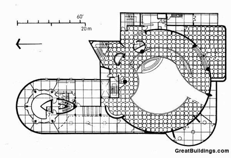
Text description provided by the architects. Swelling out towards the city of Manhattan, the Solomon R. Guggenheim Museum was the last major project designed and built by Frank Lloyd Wright between 1943 until it opened to the public in 1959, six months after his death, making it one of his longest works in creation along with one of his most popular projects. Completely contrasting the strict Manhattan city grid, the organic curves of the museum are a familiar landmark for both art lovers, visitors, and pedestrians alike.

The exterior of the Guggenheim Museum is a stacked white cylinder of reinfored concrete swirling towards the sky. The museum's dramatic curves of the exterior, however, had an even more stunning effect on the interior. Inside Wright proposed "one great space on a continuous floor," and his concept was a success.

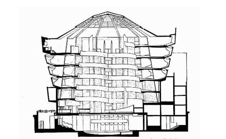
Walking inside, a visitor's first intake is a huge atrium, rising 92' in height to an expansive glass dome. Along the sides of this atrium is a continuous ramp uncoiling upwards six stories for more than one-quarter of a mile, allowing for one floor to flow into another. The ramp also creates a procession in which a visitor experiences the art displayed along the walls as they climb upwards towards the sky.

The design of the museum as one continuous floor with the levels of ramps overlooking the open atrium also allowed for the interaction of people on different levels, enhancing the design in section.

Although the space within the building is undeniably majestic and the building itself monumental, it was not perfectly successful in terms of function. The curved walls of the interior were intended so that paintings had to be tilted backward, "as on the artist's easel." This was unsuccessful because the paintings were still very difficult to display because of the concavity of the walls, and because of this before its opening 21 artists signed a letter protesting about their display of work in such a space.

Many critics also argue that the building competes with the art work that is intended to be displayed, a problem which Museum Director James Johnson Sweeney took seriously, stating, "This is the most spectacular museum interior architecturally in this country. But my job is to show off a magnificent collection to its fullest. Wright also had a problem with Manhattan's building-code administrators who argued with him over structural issues, such as the glass dome that had to be reduced in size and redesigned to include concrete ribs that are extensions of the discreet structural pillars on the exterior walls.

In 1992 the museum built an addition that was designed by Gwathmey Siegel & Associates Architects that Wright had originally intended. The architects analyzed Wright's original sketches and from his ideas they created a 10-story limestone tower that had flat walls that were more appropriate for the display of art.

Between 2005-2008 the Guggenheim Museum went under an exterior renovation where eleven coats of paint were removed from the original surface and revealed many cracks due to climatic reasons. This revelation led to extensive research in the testing of potential repair materials, as well as the restoration of the exterior.

Despite the opinion of critics, there is no doubt that Wright's design for the Guggenheim Museum provides a spatial freedom that is unique to his style. It took Wright 700 sketches and six sets of working drawings to turn his vision into an extraordinary sculpture of a building overlooking Central Park, that in the very least should be acknowledged as one of the most spatially beautiful International-style works of architecture.

This building is part of our Architecture City Guide: New York. Check all the other buildings on this guide right here.


