-
Architects: Mac-Interactive Architects
-
Photographs:Murray Fredericks

Text description provided by the architects. A new-build house replacing two very narrow 2-storey weather-board cottages on the same lot but in a very derelict state. After much discussion with Heritage it was felt that it would not be possible to restore them to anything other than museum status as they could not be brought up to current BCA standards. It was also felt that they were not of that much interest and very little original fabric existed. A fairly unique opportunity presented itself to insert a contemporary building into a heritage conservation area – allowing for a future reading of this particular period of Sydney’s development.

The Client’s brief was clear – they did not want a white box minimalist house. Nor did they want a house that dictated the style under which they should live. Visiting the Client for the first time to take the project brief, we observed that they had a very eclectic and interesting collection of artworks, designer furniture, industrial junk and ‘found-objects’. This diversity combined with the brief that the style not dominate, seemed to lend itself to a more quirky and complex form (both internally and externally). From here the project became about creating a child friendly house that had character and a story to tell. The house has already been dubbed The Ark by the locals.

This project presented an opportunity to re-visit the Sydney terraced house typology, which in recent years has been going through extensive re-assessment, as all terrace-houses are turned on their heads to connect the living area (previously a formal room at the front of a terrace) with the rear yard – the new focal point. The kitchen has now become the central, less formal hub of the contemporary house.

To improve the quality of space (height) the entire building was dug marginally below pavement level to allow for more generous headroom within all levels. Advantage was taken of the (council-owned) pocket park which had the benefit of mature planting and is a much used facility in the community. Whilst the design clearly benefits from the pocket park on one side; the design could work equally well without the side windows.

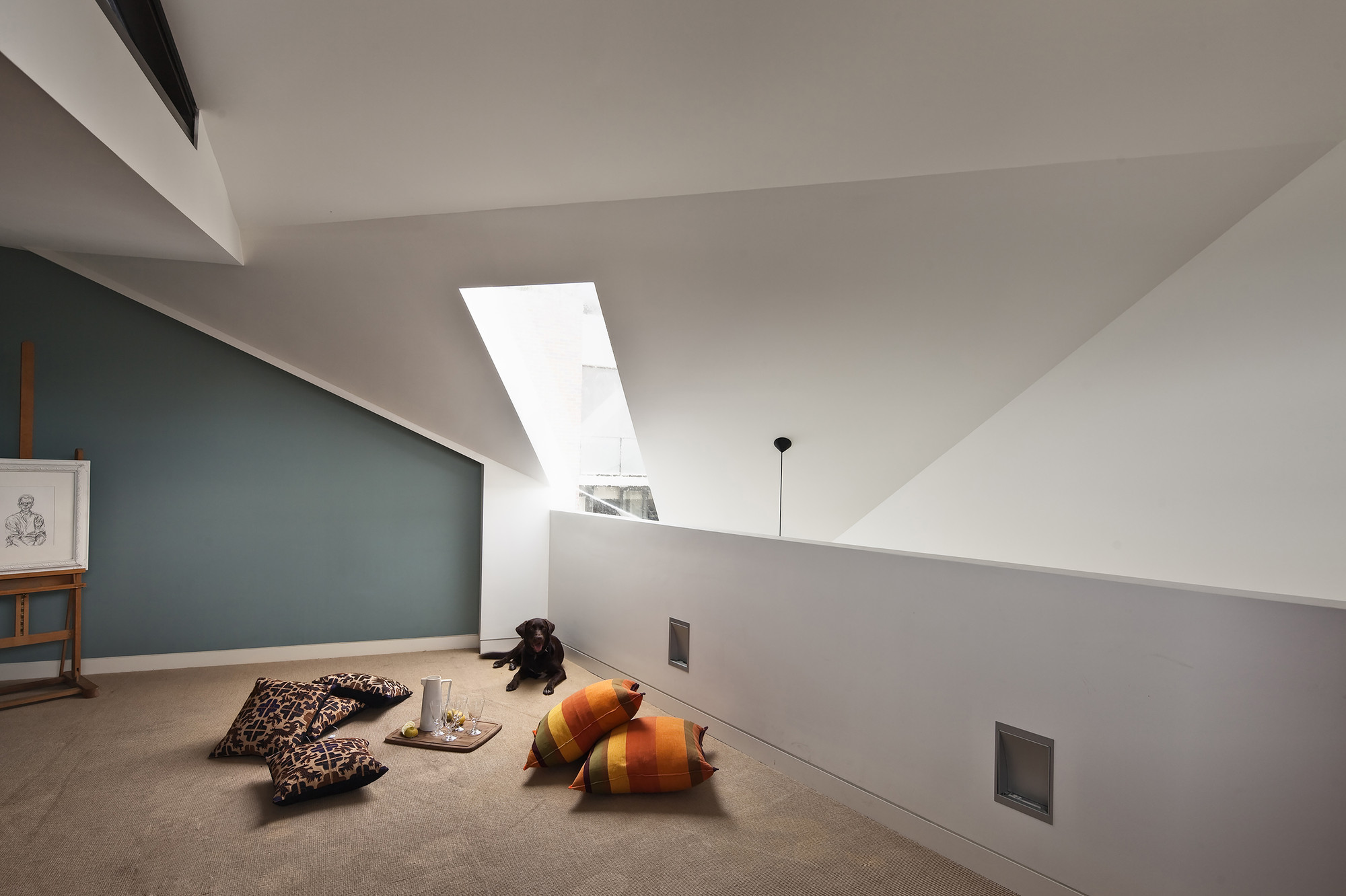
The rumpus/play space in this house; in what would have been the attic in a traditional terrace remains connected to the rest of the house by being a mezzanine/loft configuration.

Architecturally, the form came directly from combining both the context of the surrounding 2/3/4 storey buildings and the numerical planning controls determined by Council – as well as book-ending the urban block and addressing the park.

As the diagram above seeks to demonstrate – once the numerical planning parameters were established they were then manipulated to respond to the context a mixture of 2, 3 and 4 storey neighbours) – thus deriving a form which was then articulated / sculpted by windows/fenestration that further erode the building “block”.

The (Grey Box) timber cladding to the exterior was a direct homage to the derelict weatherboard cottage that previously sat on the site and the house makes reference to both the original and new building lines that create the streetscape.

Colour and materiality were used to articulate the client’s brief to separate the living space (passive - entertainment) from the kitchen/dining (active – entertaining). At the same time there was a desire to link the two spaces indicate the journey that could be made either through to the rear of the house or upstairs.

Internally the programmatic intent was to avoid a white box and ensure that the ground floor did not feel like a ‘tube’ of living spaces. To achieve this, the living room and dining/kitchen area were separated by a joinery form that wrapped around the staircase, housing kitchen, under stair W.C./laundry and TV/Stereos.


