-
Architects: Hooba Design
- Area: 28 m²
- Year: 2014
-
Photographs:Parham Taghioff

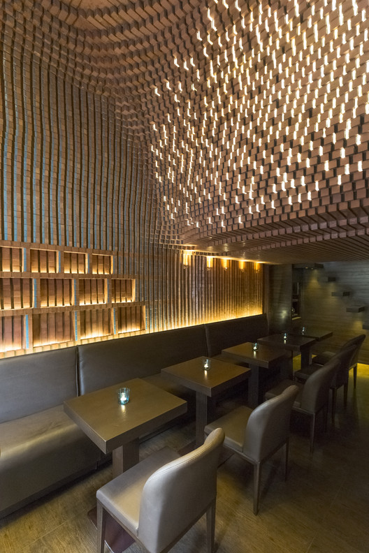
Text description provided by the architects. Espriss Cafe with 28sq2 space is located in Nejatollahi street in centre of Tehran surrounded by Iranian handicrafts shops, neighboring the building of Iranian handicrafts Organization. The aim of the project was to renovate a gift shop and change it to a cafe, considering the small size of the project and its location the main idea inspired by the urban context to transform the traditional elements into an architectural interior space.

In designing the spatial diagram, the materiality concept is based on an integrated geometry continues from outside to inside.
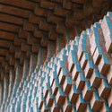
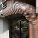
The neighboring building, Iranian handicrafts Organization with brick facade, was the inspiration to use the same material for the cafe. Concerning the small size of the project, a brick with 5*10*20 dimensions sliced into eight smaller pieces of 5*5*5 centimeters which one side of the bricks glazed in turquoise blue color. The terracotta bricks are also hygienic as they covered with antibacterial layer.

Taking a glance at the existing building with two meters ceiling height on ground floor and lower height on mezzanine floor became the starting point to design the spatial diagram that could work out the issue of the existing structure.
At the begin half of the mezzanine floor demolished and changed into a smaller level to reach a higher ceiling for ground level, then the kitchen with services area placed in the mezzanine floor connected with the other level by stairs and a small lift.
.jpg?1416278002)
Next step was providing a ventilation system for the kitchen in the spatial diagram. The purpose was to hide the ventilation system inside the form and link it to the kitchen, so the 3D diagram stretched from outside to inside of the volume and create a connection among the kitchen, internal space and the outer geometry.
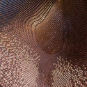
The 3D diagram created an integrated structure for all the features required to work out the issues of the existing structure which also introduce morphology of brick an light as all the bricks are positioned based on the 3D diagram.

One of the main issues of design was creating a visual variation of the form in a small space. In this concept, the situation of visitors in relation to the project is significant in order to understand the form as they can differently perceive the composition of colors on the bricks regarding to their position. The turquoise blue glazed side of the bricks are facing south shaped with the monolithic geometry of brick laying that was modeled by the 3D diagram started from the pavement of the pedestrian and continues inside of the cafe.
The lightening of the project is formed by the lamps provided in the gaps in between the joints of the bricks inspired by Iranian traditional architecture which translated into a modern language of design.
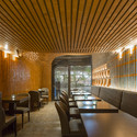
The other material used for the interior space is dark wood includes the floor, furniture, and back side wall linked with kitchen.

In conclusion the spatial diagram regarding the materiality and function are divided into two divisions as follows:
1. Inside kitchen space linked to the ground floor with the back side wall and finally demonstrate the entrance door as this part invisible the venting installations above the doorway.
2. The other outer part of the diagram demonstrate all the brick surfaces including the facade, kitchen, ventilation system, interior walls and ceilings which starts from the pedestrian pavement in front of the cafe and stretched up to the facade and continues inside. Also all future requirements such as spots for hanging pictures are shaped with the bricklaying to avoid using other elements.

Renovation and Construction
At last the goal was to develop a simple technique so every builder would be able to complete the construction.

To achieve this goal each section of brick contours printed in large format in one to one scale. the metal frames placed on the printed posters and bent following the curve lines, each brick positioned using the small cylinders attached to the frames and installed via the holes on the back side of the bricks which done in order to the 3D spatial diagram.
Combination of SMD lamps with Plexiglas material selected for this project so fixing and changing them would be manually done in the future.

Innovation and features
1. Integraion of volume and details in walls, ceilings, indoor and outdoor lightening with a traditional material inspired from Iranian architecture to introduce an identity for the project
.jpg?1416277954)
2. Creating connection between the cafe and the urban context which is famous for Iranian handicrafts products.
3. Use of turquoise blue color glazed inspired from Iranian traditional architecture to generate combination of color and light in a small space.

4. Artificial lightening merged with bricklaying geometry
5. Avoid using variety of materials to emphasize the integration of the form.

6. Creating a 3D spatial diagram to answer all the requirements of the design and to demonstrate the brick work of the form
7. Hiding the installation systems of the cafe in-between the layers of the volume
8. Developing simple construction methods considering the complexity of the form




.jpg?1416277899)
.jpg?1416277954)
.jpg?1416277912)
.jpg?1416277961)
.jpg?1416278007)
.jpg?1416278002)
