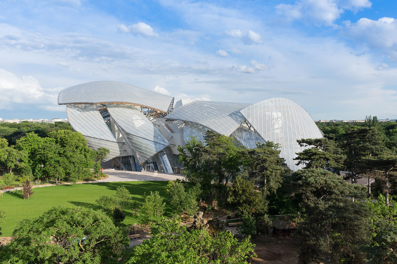
The people behind Frank Gehry's Fondation Louis Vuitton (FLV) in Paris, which is set to officially open on the 27th October 2014, recently invited a band of architecture critics to take a look around and pen their thoughts. Gehry's bold approach to architectural form, most evident in buildings like the Guggenheim Museum in Bilbao and the Walt Disney Concert Hall in LA, matches the foundation's aim to "promote and support contemporary and artistic creation" in France. According to their website, they in particular embody "a passion for artistic freedom." How, then, has the enormous sailed structure, challenged by local opposition from the outset, settled into its Parisian parkland surroundings?
See what The Guardian's Oliver Wainwright, The Observer's Rowan Moore, Vanity Fair's Paul Goldberger, The LA Times' Christopher Hawthorne, as well as the Architectural Digests' Mayer Rus, had to say about Gehry's latest completed building after the break.

Oliver Wainwright / The Guardian
Frank Gehry's Fondation Louis Vuitton shows he doesn't know when to stop.[...] It is certainly a spectacle, but it makes you wonder quite what it’s all for.
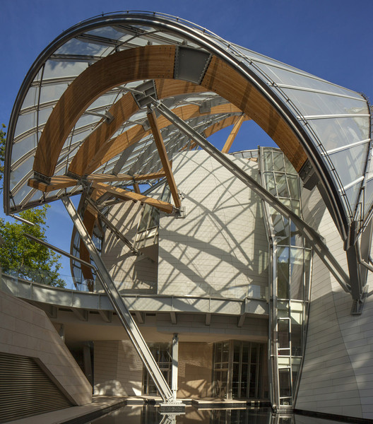
"Piled up in a staggered heap [...] as if caught in a violent storm," Wainwright's suggests that it is a 'gift' from Louis Vuitton that the "neighbourhood hasn’t seemed all that keen on receiving." Referencing the trouble the project had getting going, having been halted temporarily by the French courts, Wainwright's ultimate conclusion is that is an "indulgence of over-engineering." It is, "in reality, is a hell of a lot of steel columns and glue-laminated timber beams, thrown together in a riotous cat’s cradle of zig-zagging struts and brackets, props and braces."

Rowan Moore / The Observer
Frank Gehry’s new art museum in the Bois de Boulogne could have done without the nautical flourishes.
Moore, although less liberal with his descriptions, is similarly dismayed by some of the flamboyant engineered flourishes. In spite of this, he acknowledges that Gehry's "buildings at their best are generous, thoughtful and responsive, with a high degree of attention to the ways in which they are built." Yet, in this instance, only "some of the time the Gehry magic is there." For him, the sails "get in the way of the potentially delightful connections the building tries to make, and of the experiences of view and art." "It could be fascinating, unforgettable and beautiful" but, Moore concludes, this building falls short.

Paul Goldberger / Vanity Fair
[It] looks like sails, and it looks like a boat, and it looks like a whale, and it looks like a crystal palace that is in the middle of an explosion.
...yet, Goldberger argues, "none of these comparisons matter in the slightest." For him, it is "a new work of monumental public architecture that is not precisely like anything that anyone, including Frank Gehry, has done before." Alluding to the building's anticipated programme, Goldberger notes that "Gehry has often been accused, mostly unfairly, of making architecture that overwhelms art." However, in the case of the FLV, the "icebergs make for relatively neutral galleries - not plain white boxes - [...] but rooms that for the most part are shaped like rectangles with straight, flat walls. When there is no art in the building, it feels incomplete, which is arguably the most important test of whether the architecture is too assertive."

Christopher Hawthorne / The LA Times
The design is brilliant, a late-career triumph.
For Hawthorne, the majestic sails create a building which "joins the Guggenheim and the Walt Disney Concert Hall as the most impressive works of the architect's nearly six-decade career." For him, the material choice (glass) - which "Gehry uses here in remarkable ways" - makes the museum "as ambitious as anything Gehry has ever produced but also, surprisingly, as refined." Commenting on the internal gallery spaces, which he describes as "restrained," Hawthorne suggests that the building appears "sensibly cosmopolitan, even rational." He summarises by suggesting that "when Gehry uses a unified palette — instead of piling clashing materials and colours atop his familiar colliding forms — he doesn't dilute the power of his architecture but clarifies and strengthens it."

Mayer Rus / Architectural Digest
With its shiplike exterior of billowing glass sails, the building suggests an avant-garde update of the Jolly Roger, gracefully piloted by Peter Pan through the Bois’s verdant sea of centuries-old trees with a trail of pixie dust in its wake.
Rus' review, interspersed by comments from Gehry himself, examines the history of the project in some depth. Less opinionated that the other critics, he admires the "network of steel trusses and wood beams" which are held aloft in a "bravura feat of architectural acrobatics." He goes on to say that "Gehry has devised spaces sympathetic to art of almost every scale and medium" concluding that, on balance, the building is a tailored mirror of the site it sits in. "After all, why do people come to the Jardin if not to play?"


