This article comes courtesy of ArchDaily friend Charlotte Neilson, the author of the fascinating design blog Casting Architecture, which discusses architecture and production design. Charlotte is not only a dedicated cinephile but also an honours graduate of the University of Newcastle, Australia.
We all know that psychopaths prefer contemporary design. Hollywood has told us so for decades. The classic film connection between minimal interiors and emotional detachment (see: any Bond adversary) or modern buildings and subversive values is well documented - and regrettable. The modernist philosophy of getting to the essence of a building was intended to be liberating and enriching for the lives of occupants. Hardly fair then that these buildings are routinely portrayed with villainous associations.
What the representation of Modernist architecture in film tells us about our society, after the break...

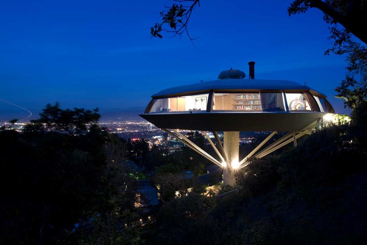
John Lautner’s work has probably suffered most at the hands of Hollywood. Having based himself in LA in the 1940’s, Lautner’s resultant body of work became fodder for the film industry. His houses have been the motivation for murder (Polin House, Twilght, 1998), witness to murder (The Malin Residence/Chemosphere, Body Double 1984), the murderer’s lair (The Elrod House, Diamonds are Forever 1971), and the object of Bruce Willis’ destructive fury (The Garcia Residence in Lethal Weapon 2, 1984).
But it wasn’t just Lautner’s work which felt films’ wrath. The 1986 film Ferris Buellers Day Off featured James Speyer’s Rose House in Illinois, an elegant steel-framed, Modern building with modular panels of glass that create a barely present built envelope. In real life, the pavilion was multi-purposed, hosting art exhibitions and auto shows; in the film, it’s a domestic garage, a space that comments upon its inhabitant’s less-than-positive values.

The house gets the full Hollywood treatment: filmed in cold hues and with very few furnishings, it seems not only institutional, but bleak and unwelcoming as a family home. Ferris complains that the house is like a museum- which makes sense, considering that the house’s owner is the distant father of Ferris’ friend Cameron, a wealthy man that, according to Ferris, has priorities that are ‘out of whack’.
But do minimal interiors still represent heartless occupants with attachment issues? If our most recent films are anything to go by, these old clichés have become less meaningful.
Take the hugely popular Twilight series. Whether you are interested in the saga or not, the buildings associated with this group of ‘vegetarian’ vampires, are certainly notable. The work of Portland’s Skylab, Vancouver-based Brian Hemingway and Brazilian architects Bernardes Arquitectura all feature prominently. These unconventional contemporary spaces represent sophisticated modern domestic design. Yes, they house vampires, but these are characters we are meant to like and approve of - particularly their choices (they fill their lives with music, art & good design rather than succumb to their less sophisticated desires). Rich finishes, timber cladding and textured elements all emphasize a connection with nature and bring the occupants a step closer to humanity.

Given that the Stephenie Meyer books depict a predominantly white, turn-of-the-century mansion for the coven’s home, there was a deliberate choice by the production team to use a warmer palette to make the spaces more appealing. This approach not only turned out to be well suited to film (and an interesting alternative to the traditional foreboding castle), but also caused a stir in online forums as fans discussed glass pivot doors, naturally lit bathrooms and the use of timber. That’s right. Teenagers talking about architecture. And with approval.
The growing computer graphics industry has also had it’s effect on the old stereotypes. 2010’s Iron Man 2 featured a Lautner-inspired cliffside design to accommodate it’s central character, Tony Stark. Digitally created for the film, the house is an upscaled Chemosphere, relocated to a dramatic location and refitted to suit a tech age billionaire. Lautner’s timeless, centrally-supported silhouette and characteristic dramatic volumes are celebrated. Oh, and Tony Stark is also an unequivocal hero.

So why has our relationship with Modernism, as reflected in film, changed? It could be that, with the advent of smart phones and wireless technology, that we now consider it preferable - and not psychopathic - to live in houses without the traditional trappings.
However, it could also be an effect of our economic reality. It’s hard not to compare this recent turn of events to the introduction of ‘moderne’ styling in cinema of the 1930’s. Led by legendary MGM Art Director Cedric Gibbons, the clean stylised lines and geometric details of what is today known as “art deco” translated well to the back and white medium of the day; but, more importantly, it also allowed a glimpse into a monied, carefree world, providing a kind of escapism audiences were looking for during the Great Depression. Are we seeing a similar effect from the current Recession?

Either way, it seems we are entering into a cinematic era that actually embraces the vision offered by the architectural profession. With the changing portrayal of modern architecture in production design and the popular revival of mid century modernism, today’s films are correcting the disservice handed to modernist buildings in the past. At last.


