-
Architects: Kavellaris Urban Design
- Area: 8600 m²
- Year: 2010
Text description provided by the architects. The subject site fronts a main street to the south and a private car park that abuts and wraps around the northern and eastern interfaces of the site. The car park service’s RMIT University and is wedged between the subject site and a railway corridor. And although the car park is a private space it is utilized as a public thoroughfare from the Jewell train station opposite the University and from Dawson Street to the North. As a result, these site conditions provided for a building that is highly visible without any obstruction.

The Jewell project draws on classical design principles which we consider to be not only relevant to contemporary architecture, but are design strategies that are essential for good design. We incorporated landscaped streets and laneways within the subject site to provide spatial separation between dwellings an enable every habitable space to receive natural light and ventilation. In addition, these separations allow the spaces to be naturally cross ventilated thereby minimising the need for air-conditioning. Low emission lighting and solar panels further reduced the carbon footprint of the complex. We also incorporated a 40,000 litre underground storm water collection tank that is used for toilet flushing.

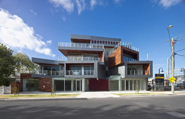
The rhythmic boxed geometries are referential variations of the same architectural language resulting in a sculptured building that evokes a sense of movement. As the building is experienced from the various vantage points, the building form takes on different readings. This movement is reinforced by the reflective nature of the facades metallic cladding that changes the textural qualities and colour of the building with the varying light and shadows of the day.

The asymmetrical forms that wrap around the edges of the building form a continuous architectural expression. The southern elevation has been specifically design with a constructed view of the building typical of the classical order when viewed from the Street. Vertical strip windows capture the opposing perspective providing a visual connection and a conclusion to the journey for occupants that have entered the building from Watson Street. The accented double height entry void that interrupts the rhythmic articulation of the composition emphasises and clearly announces the entry into the building as seen from the Street.

We used three species of timber to accent elements of the composition in order to establish an immediate dialogue with the juxtaposed buildings and generated synergies that accentuate the sculptured qualities of the building.


