-
Architects: LosdelDesierto
- Area: 874 m²
- Year: 2009
-
Photographs:Jesús Granada
Text description provided by the architects. The aim of this project was to help the development of psychomotor, mental, and social abilities. At an early age and instinctively, children identify the pitched roof with the house, hence their drawings: the roof, the box and, last, the doors and windows. A nursery is but a “big - house” in which they spend most of their time. This idea, interpreted of course, is the origin of this proposal. The big structural slab (roof) is folded in space. This allows us to double the height of the floor so as to adapt the skyline to the next buildings as well as to amplify the interior space and the natural light. This cover wraps all the rooms in the nursery and houses most of the facilities (plumbing, telecommunication and lighting). Below this heaven-tent, the program develops into eight classrooms assigned to three groups of children, divided according to age. There is also a polyvalent dining-room, a kitchen, and administration offices distributed around a patio where children play. The different classrooms are connected to open-air spaces, which permit a permanent inside-outside relationship.

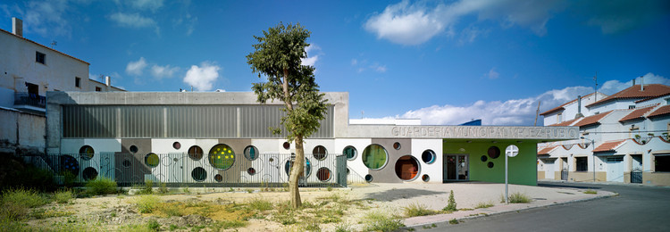
Once the roof and the program were designed, LosdelDesierto had to decide upon the façade. They did not want the traditional windows that abound in the village; They wanted to give a special identity to the building. So they made up a simple system of panels in the form of a jigsaw puzzle to configure the distribution of voids in the façade. The circular trims are colored with special films in green-yellow, blue and magenta tones inside a laminated glass. During the day, the interior is tainted with different colors, like natural lanterns. At night the interior lights illuminate the façade, giving the quarter a fun look.

LosdelDesierto used a flexible vinyl laminate for floors and the base of walls. The color of the material is used to differentiate classrooms by the age of the students. The world of the children is separated from the worlds of adults through the color in the walls, which disappears at 1,30 meter, the height of the spatial vision of a child. Above this limit, the surfaces of the walls are unfinished and the facilities are all visible. At best, they are just treated with polyurethane so that they can be easily cleaned. As heating system, the nursery has under floor heating, ideal for this building type. Moreover, this system is compatible with the production of hot water by installing solar collecting equipment attached to the roof, thereby reducing energy expenditure.

LosdelDesierto understood that a building must satisfy its users’ needs. And, they say, “if we are speaking of children up to 3 years, they must have fun. Color is very important at an early age. Our son at that age used color to differentiate, distribute and construct jigsaw puzzles and sentences.” The building incorporates color in the vinyl laminates of the floors and wall bases. It separates children according to their ages and distinguishes the common spaces from the classrooms. Their selection criterion, they claim, contributes to the development of their psychomotor, mental and social capacities. For the classrooms designed for children under 1 year the color is blue (relaxation, the sea, the world of dreams); classrooms for children between 1 and 2 are painted in orange (psychomotor stimulation, activity); for children between 2 and 3 years of age, the color chosen is green (contact with nature). And common spaces use mixed colors: it is the world of society and the collective. The program runs easily around a central playground (extension of the dining room or multipurpose room), but the folding of the roof slab deforms the rational stay prism (3.20 m) and wide interior space to the outer limits the building (5.80 m). On the scale of babies, packed dimensions are a huge world, with an own sky drawn by the nonlinear distribution of the fixtures.

From the architectonic point of view the wrapping of the building would admit voids in different shapes: square, star, heart, and triangle. That is to say, the weight of the project rests on the slab and the façade is an element that simply separates the interior from the exterior. But LosdelDesierto were looking for a connection between this perforation and the user. The circle suggests many analogies (hole, eye, game, moon…) and, above all, it lacks angles and can be used as table, seat and even as a hammock. Three different diameters (1,80m; 1,00m; 0,40m) define the holes in this Gruyere cheese. Ergonomy and simplicity, however, dictate that only those of intermediate dimension are practicable. The original project included the use of prefabricated concrete pieces to solve the shape of the holes and the assemblage of the big pieces. During construction, for logistic reasons, we discarded prefab material in favor of the traditional brick wall (brick 19cm + air chamber + insulation + brick 9cm). They also had to change the criterion for assemblage. They inverted the construction logic. First, there was the hole and then the wrapping. The layout of the steel rings (1 cm thick and 40 cm wide) sustained the carpentry in lacquered aluminum.

The decision on the part of the town hall to place the center in a residential area both conferred identity and revalued the area. It is a quiet neighborhood with a high percentage of old people. The coming and going of families taking their children to the nursery contributes to the social wellbeing of the community and undoubtedly helps pass the time of those who sit in the balcony to watch the comings and goings of children. People have welcomed the building. They interpret the building in their own ways, but they do not think it does not fit its surroundings. Maybe because the circles in different colors make them think of the flowerpots hanging on the walls of their patios.


